Mindfulness and habit-building app
Daybrake is a mindfulness and habit-building app designed to help users create a balanced life, encouraging healthy habits while letting go of others. The app’s goal is to bring harmony across various aspects of users’ lives through daily practices, habit tracking, and educative content.
What did I do?
-
01UX design
-
02UI design
-
03Illustrations
What did I use?
-
Figma
-
Adobe Illustrator
-
Procreate
Challenge and focus
The Daybrake app is heavily driven by its brand story, which needed to be reflected across the user experience. As the primary touchpoint of the brand, the app had to tell this story in an engaging, intuitive manner.
Key challenges included:
- Designing an intuitive information architecture, especially given that the app launched with five content categories, with more planned for future releases;
- Easy navigation, a weakness in many competing apps, so that users could quickly find relevant content;
- Supporting users in building lasting habits by delivering exercises, learnings, and routines at the most opportune moments.
The design goals were to:
- Create an intuitive content architecture;
- Incorporate storytelling through visual elements;
- Gamify the habit-building experience for greater user engagement.
Process and design
Process and design
I mapped out user journeys focusing on two key types of activities:
- Discovering new content: Users needed to easily explore recommended exercises, articles, and routines tailored to their preferences, past behaviors, and even time of day.
- Building habits: The app needed to help users create and track habits, offering gentle reminders to encourage daily practices and routines.
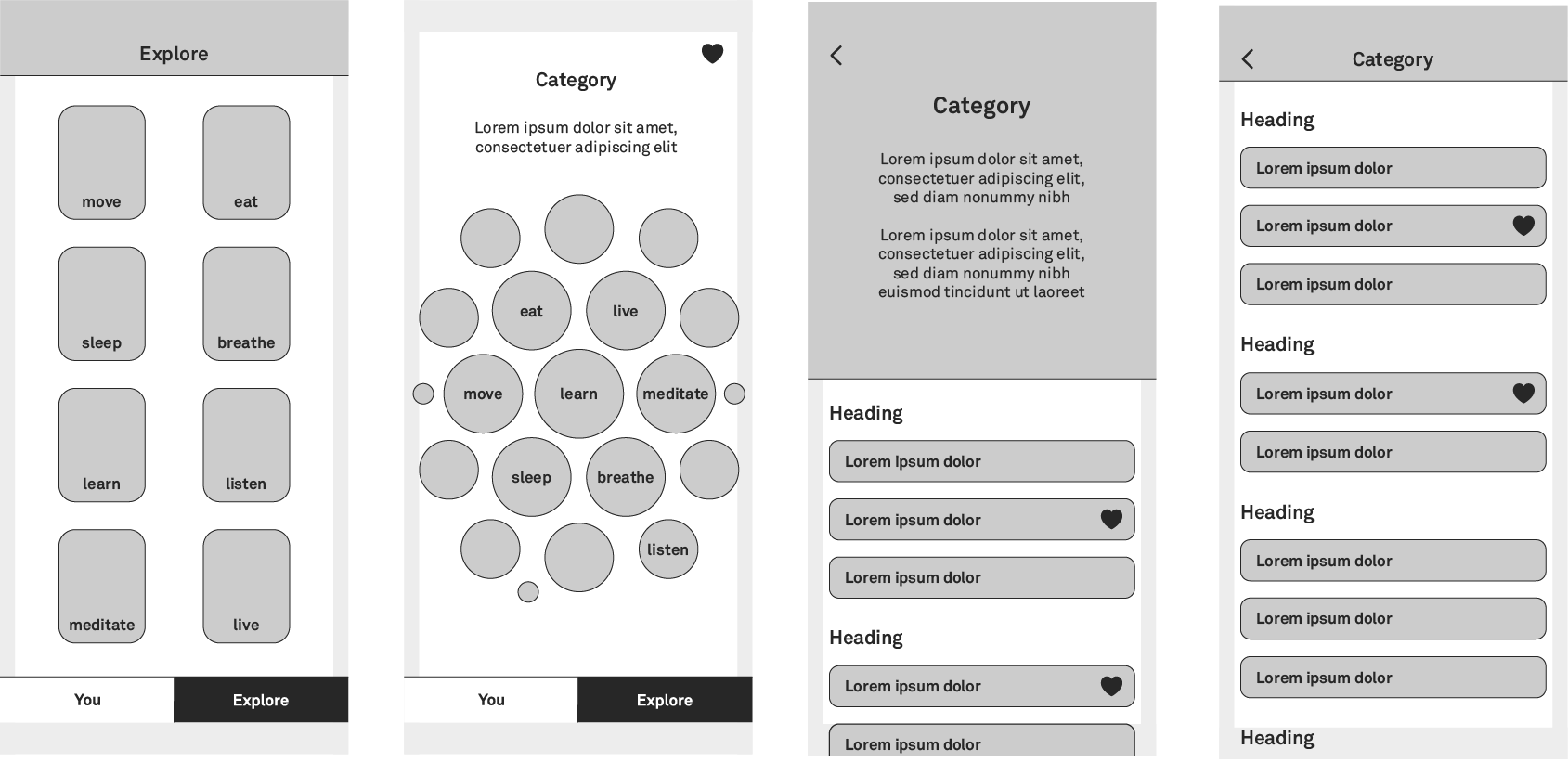
Wireframes and information architecture
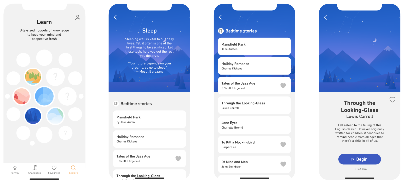
The app’s homepage, the For You screen, was designed to serve personalised content based on the user’s prior activity, time of day, and even the weather. The navigational structure was kept shallow, ensuring users could find what they needed within two steps.
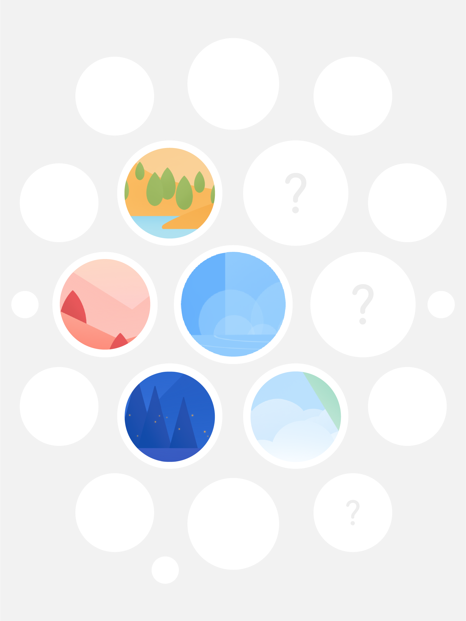
To address the challenge of balancing multiple content categories without hierarchy, I tested various structures. Ultimately arriving at a solution where content was displayed in a ‘round table’ layout, later refined into a beehive pattern inspired by the app grid used in the Apple Watch. This created a non-hierarchical structure that allowed users to explore content freely without feeling directed toward specific categories.
Prototyping and testing
While developing wireframes, a main focus was to encourage discoverability across categories without the user losing their orientation within the app. This led to iterations where I experimented with different patterns and layouts, eventually arriving at a modular design that could accommodate the growing amount of content.
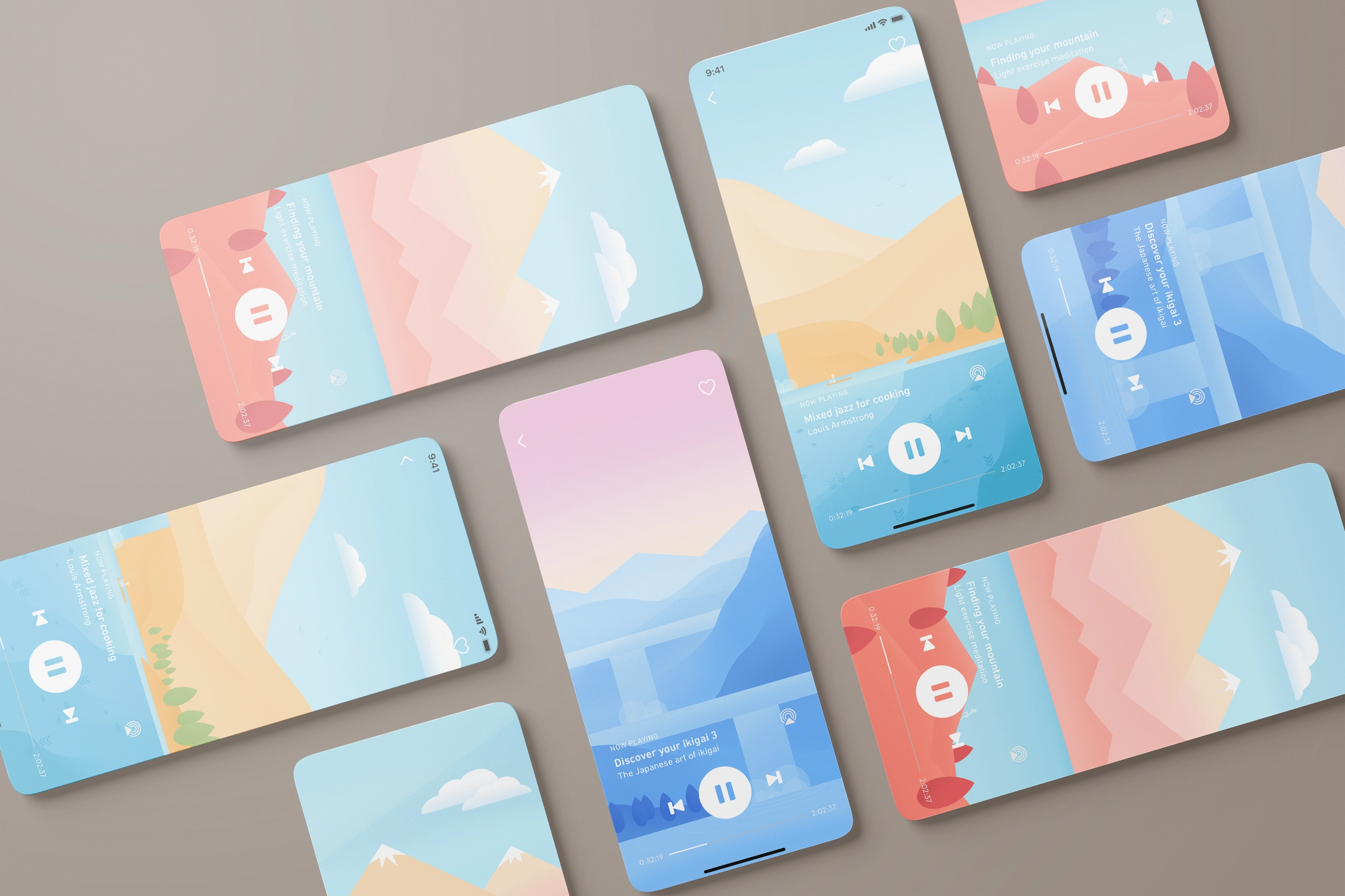
Additionally, visual storytelling was integrated through illustrations that served as navigational aids, making the experience both visually engaging and intuitive. Each category was given its own colour scheme, providing users with a subtle emotional connection to the content.
Final design
The final design features a seamless navigation flow, with no more than two steps needed to access any piece of content. Users can easily favourite items, revisit past sessions, and receive personalised content based on their activity.
The beehive layout created an engaging, non-hierarchical start of the browsing experience. The shallow navigational structure allows users to freely explore different categories without the risk of getting lost. The app’s illustrations contributed to its calm aesthetic and also acted as visual breadcrumbs to enhance the user flow even further.
The habit-building features are gamified, with users able to track progress on specific habits, earn streaks, and receive prompts based on their routine preferences.
Client feedback
When the design was delivered, the client especially loved the uncomplicated yet unhierarchical way of browsing content and how the app tells the brand story. They couldn’t wait to have the app ready for users to dive into.
Reflection and next steps
Key learnings
This project was a rewarding experience, especially in terms of balancing brand storytelling with intuitive UX. A key takeaway was the importance of modularity in the navigational structure to handle future growth of content and features.
Creating a flexible, unhierarchical way to browse content was a unique challenge, but ultimately resulted in a design that the client loved. The ability to blend illustrations with UX also allowed for a more immersive experience that aligned with the app’s mission of mindfulness and balance.
Future recommendations
I recommend further user testing on how users engage with the habit-tracking features to see if more gamification elements could enhance long-term engagement. As the content library grows, information architecture tests such as card sorting and tree testing will ensure the app’s navigational design continues to evolve intuitively.


