Environmental footprint insights platform for SMEs
Effix’s platform provides SMEs with an AI-driven dashboard to track their environmental footprint (EF) and gain actionable insights. The platform helps businesses reduce costs and improve sustainability. It also generates comprehensive sustainability reports for external stakeholders, promoting transparency and accountability.
What did I do?
-
01UX design
-
02UI design
-
03Brand identity elements
What did I use?
-
Figma
-
Adobe Illustrator
-
Procreate
Challenge and focus
Effix’s primary objective was to create a user-friendly platform that empowers SME decision-makers to easily manage their energy usage and reduce environmental impact. The platform’s dual purpose included offering businesses actionable insights while also generating sustainability reports for external audiences.
The main challenges were to:
- Provide a clear, comprehensive overview of energy usage across multiple resource categories;
- Ensure a seamless user experience on both desktop and mobile devices;
- Balance the needs of SME decision-makers with the demands of external stakeholders interested in sustainability metrics.
Process and design
User research and personas
To guide the design, I began with user research and created two primary personas:
- SME decision-makers: These users needed an efficient way to track energy usage across various categories and get expert advice on reducing costs.
- External stakeholders: These users required easily accessible, transparent sustainability reports to understand a company’s environmental impact.
User journeys
I mapped out user journeys for each persona:
- SME Decision-Makers: The dashboard needed to allow these users to quickly navigate between high-level summaries and detailed insights on energy usage, costs, and emissions. The option to reach out to sustainability experts for further guidance was essential.
- External Stakeholders: These users needed to be able to find and download sustainability reports that provided detailed information about the company’s resource usage and sustainability efforts.
Wireframes and information architecture
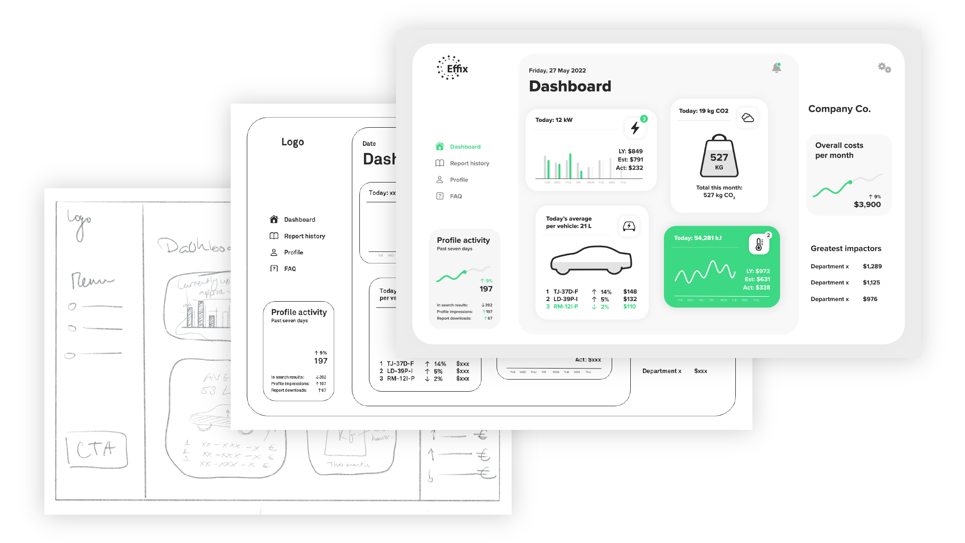
The design process began with low-fidelity wireframes that laid out the core features, such as the dashboard and detailed usage views. Using card sorting tests, I organised the interface’s key elements (energy usage, emissions, expert consultation, etc.) to reflect users’ mental models. This helped establish a logical structure for navigating the various energy categories (e.g., electricity, water, gas), ensuring that users could find the right data quickly.
Prototyping and testing
I built high-fidelity prototypes in Figma, which were tested with users. Usability testing revealed some key areas for improvement:
- The comparison views of energy usage across departments needed simplification to make them more “glanceable” for decision-makers.
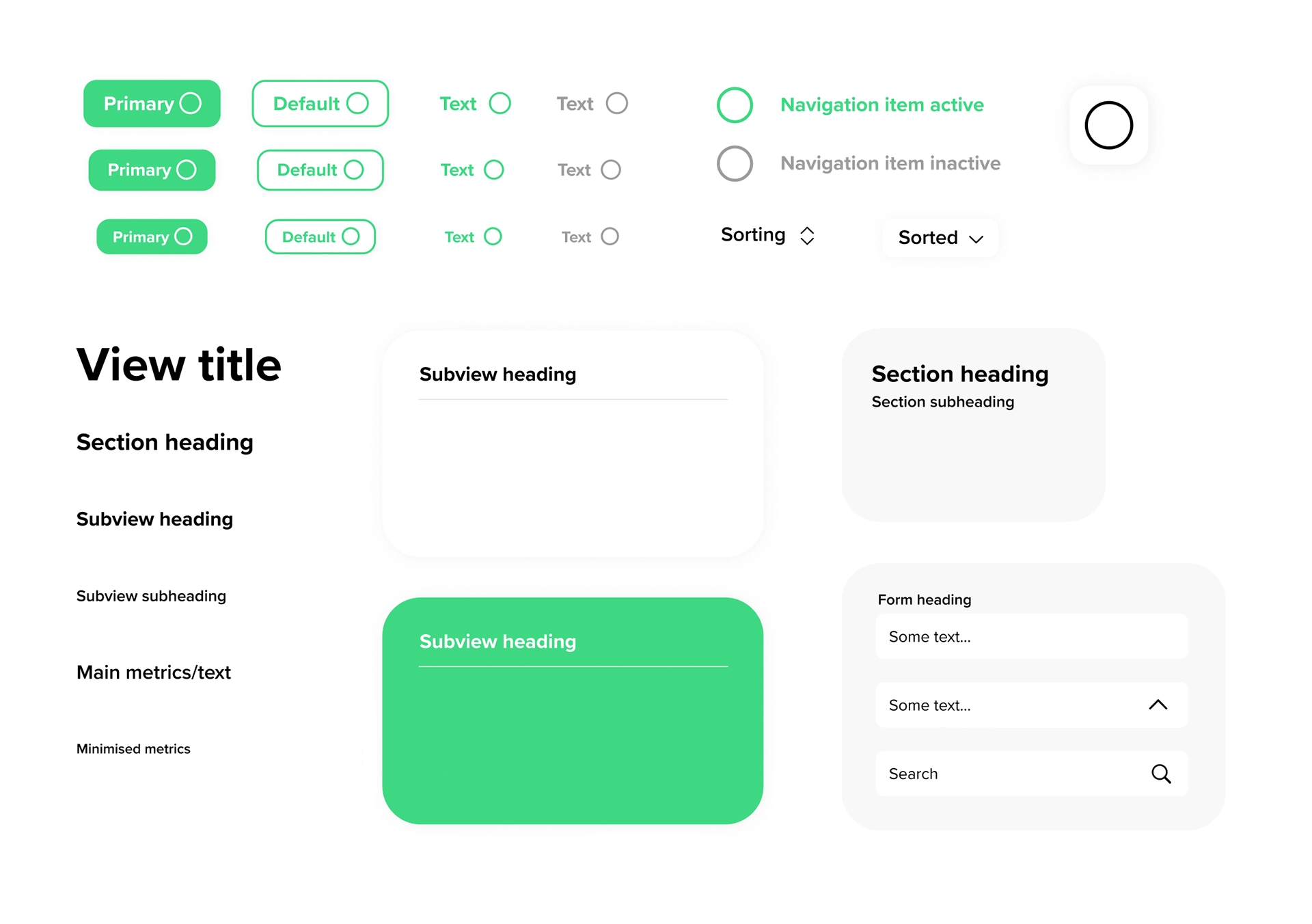
- The iconography for key features, such as reaching out to sustainability experts, was revised to improve ease of use across desktop and touch devices.
Final design
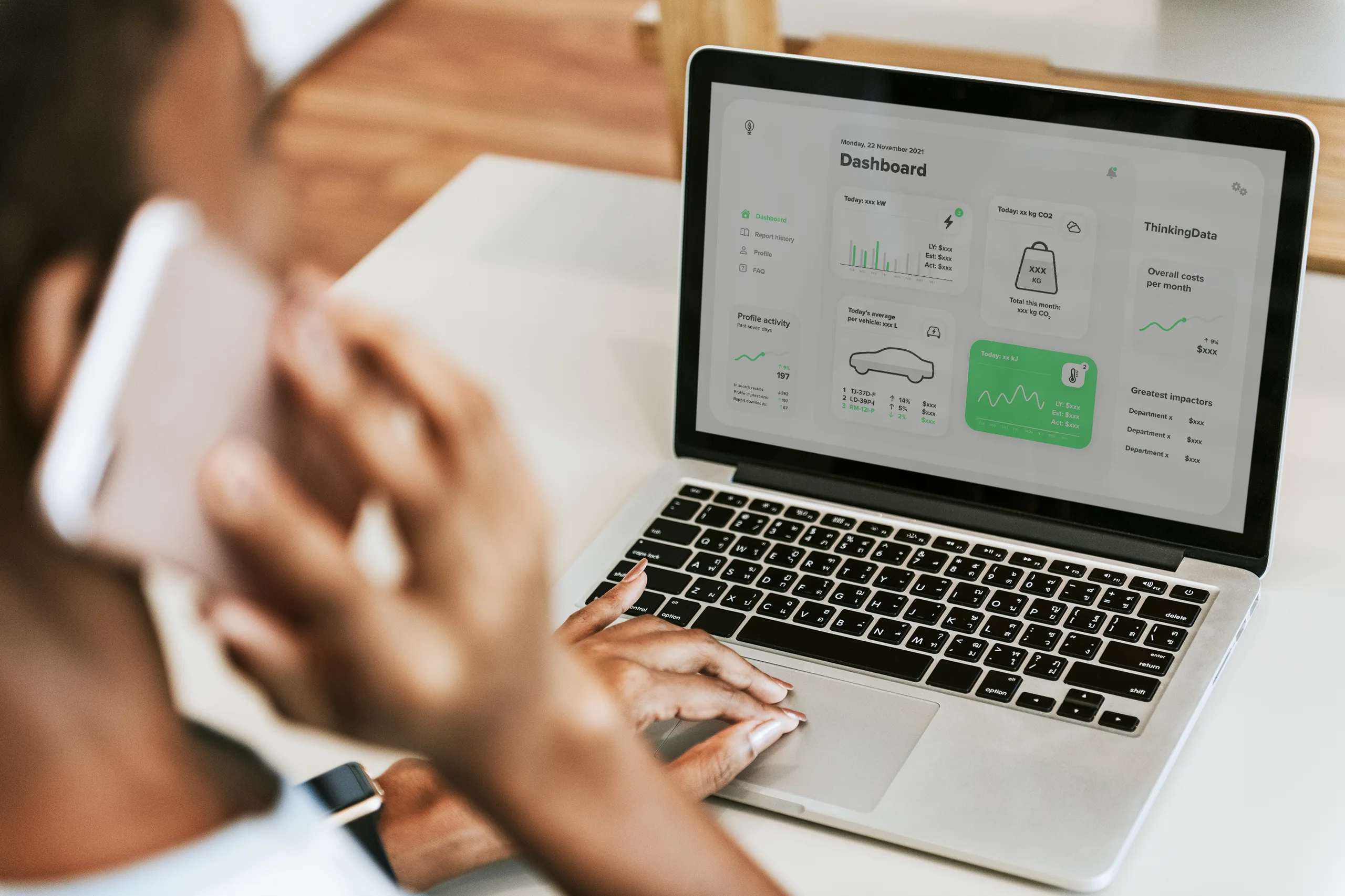
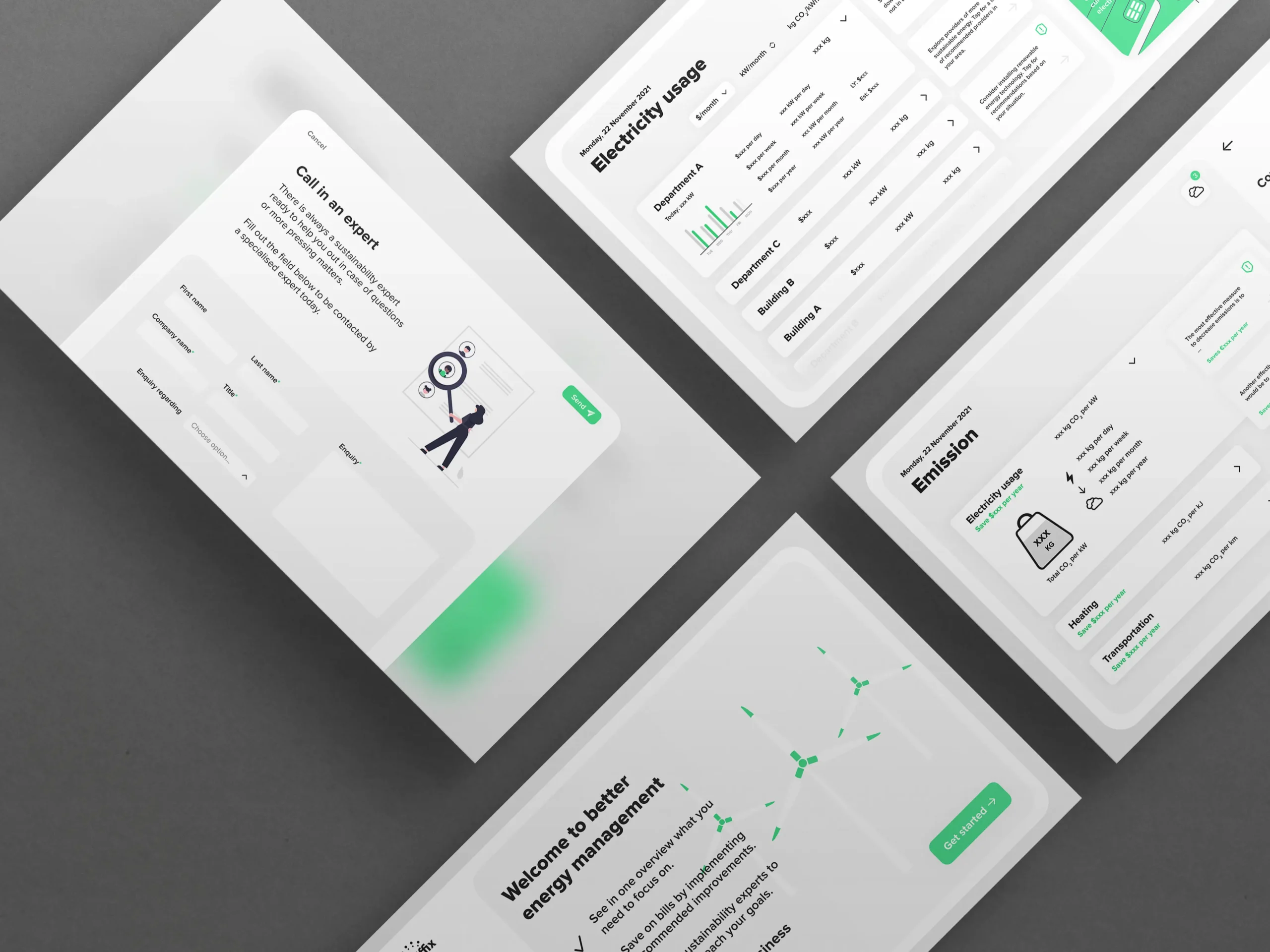
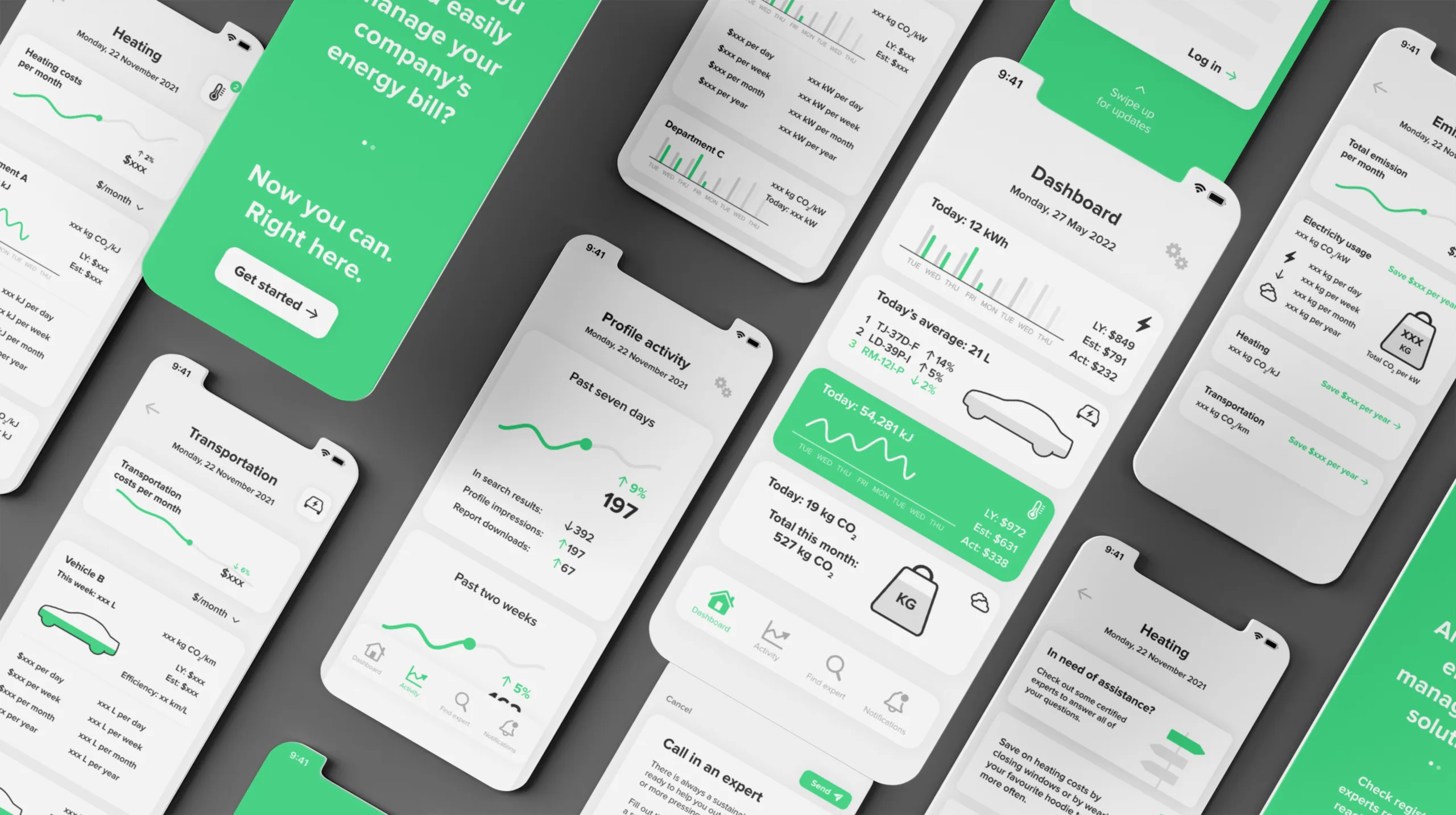
The final design of the Effix dashboard provides an at-a-glance view of energy consumption and emissions across various resource categories. It allows decision-makers to access detailed insights, track trends over time, and consult sustainability experts when necessary. The dashboard’s modular design ensures that it remains flexible as the platform evolves.
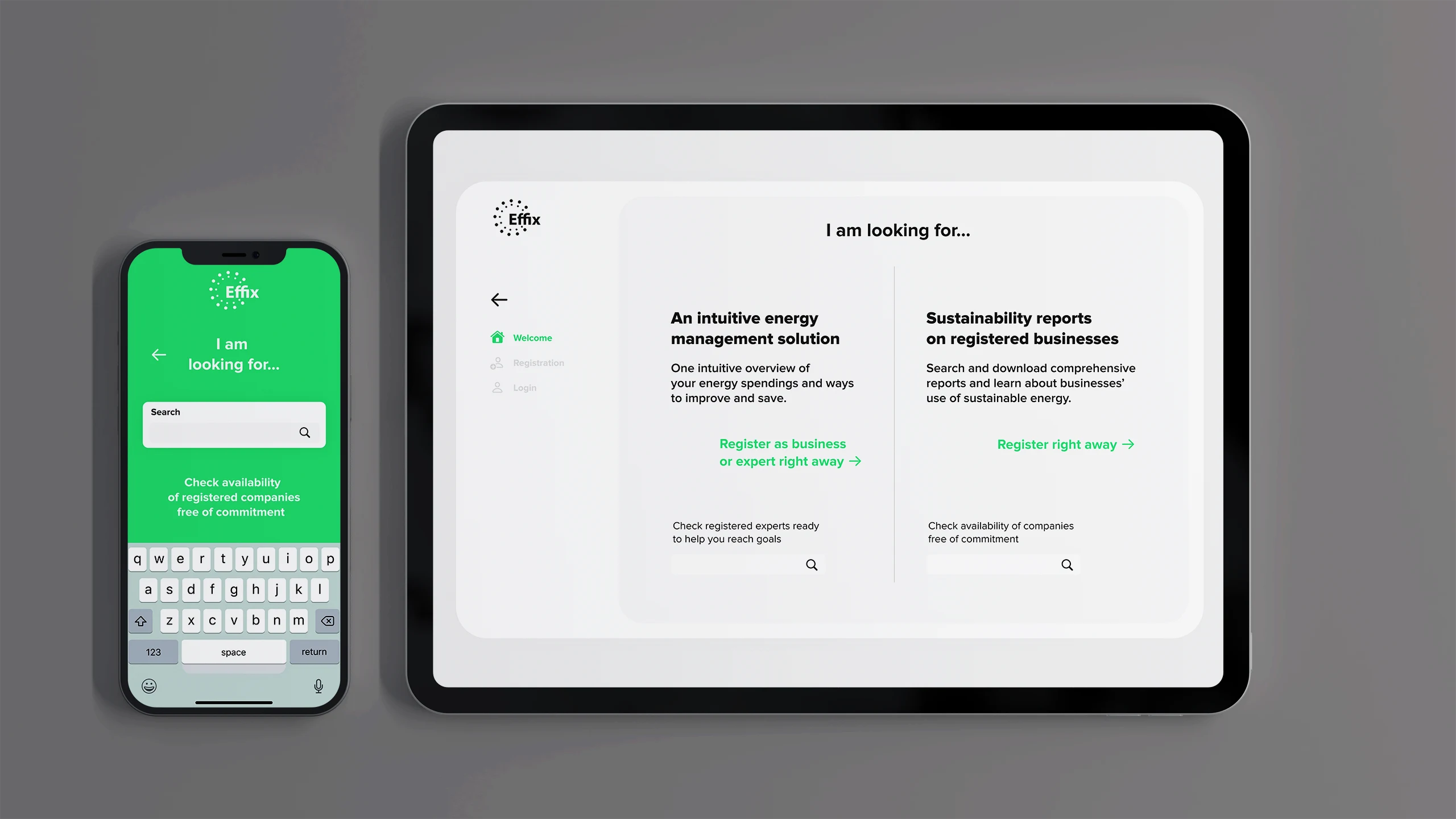
External stakeholders can search and find sustainability reports generated by the platform, offering transparency into businesses’ environmental efforts and encouraging accountability.
Client feedback
‘An excellent experience to work with Lars again, this time for the UI design of an app. He never fails to impress and I appreciated his timely inputs. As I’ve come to know him, he hits right on the mark with his designs whether it’s new or follow-up work. We gladly continue to use his services.’
Reflection and next steps
Key learnings
One of the most exciting parts of this project was the challenge of organising complex energy data into an intuitive and glanceable interface. Separating the user flows for decision-makers and external stakeholders right from the registration step was crucial in making both experiences intuitive. The use of icons and modular widgets helped streamline navigation while delivering the right level of detail at the right time.
Future recommendations
To continue refining the platform, I recommend further A/B testing on different dashboard layouts to enhance user engagement and ease of use. Tree testing and additional card sorting will ensure that the information architecture remains intuitive as more features are added. Furthermore, more prototype testing with users will help assess the impact of various data visualisation techniques to optimise the user experience.
