Brazilian skincare brand, website, and packaging
What did I do?
-
01Brand strategy
-
02Verbal identity design
-
03Visual identity design
-
04Packaging design
-
05UI/Web design
-
06Development
What did I use?
-
Adobe Illustrator
-
Figma
-
WordPress
-
Silhouette Studio
Strategy and identity
Strategically, Jardê looks to fill a gap for consumers who do want natural products that don’t harm the environment, but prioritse quality and practicality over unwavering ideology.
The aims for the brand identity were to:
- Make skincare routines enjoyable and fun;
- Maintain a certain level of professionalism;
- Differentiate from the home-made product category.
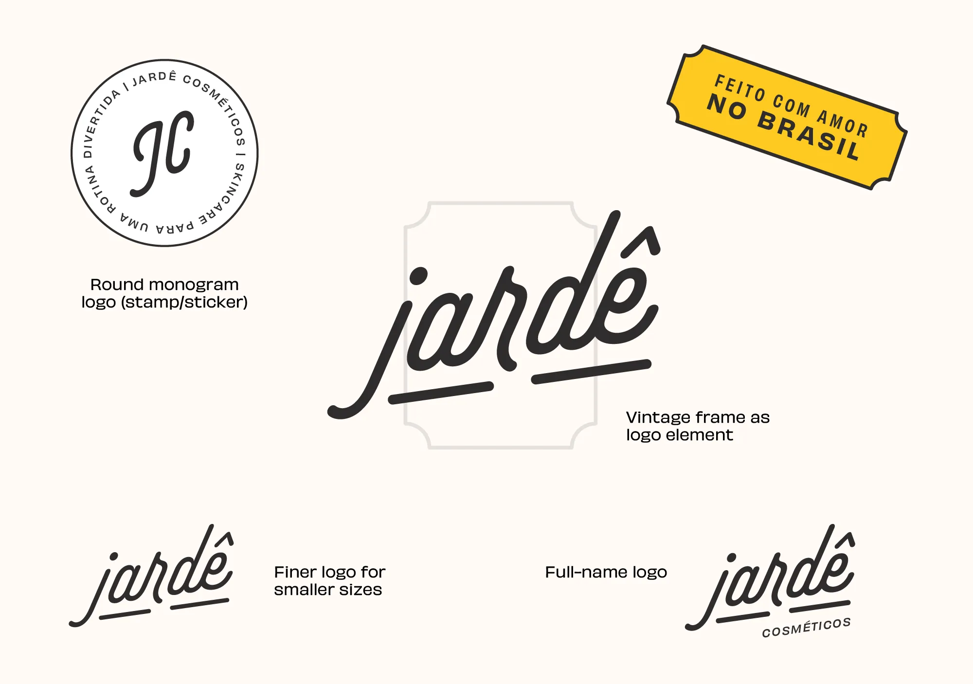
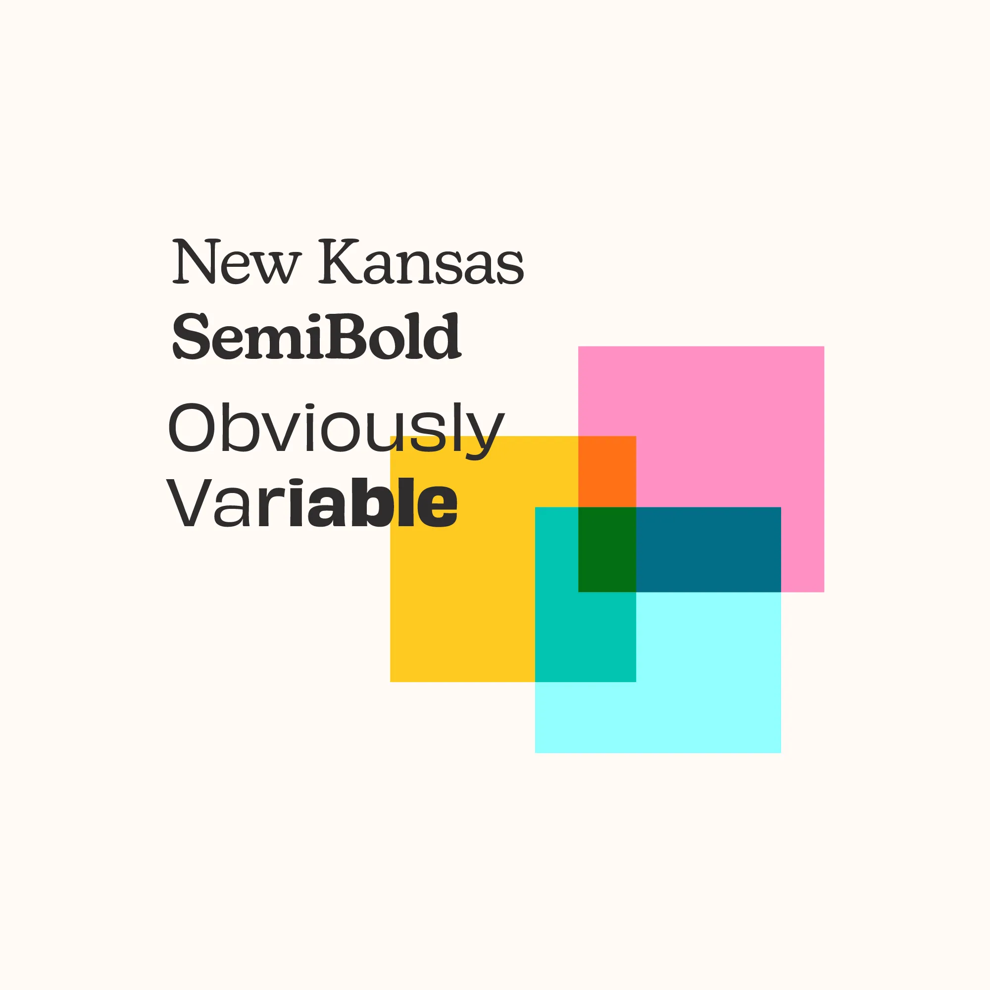
The finished identity is a colourful and fun-looking company. It marries a ‘good old times’ feeling with that of a modern brand. This is also reflected in typography choices: a hint of old-style combined with playfulness. The use of the brand’s three primary colours paired with the subtler faded tones really makes for a balanced yet delighful experience.
Packaging and website
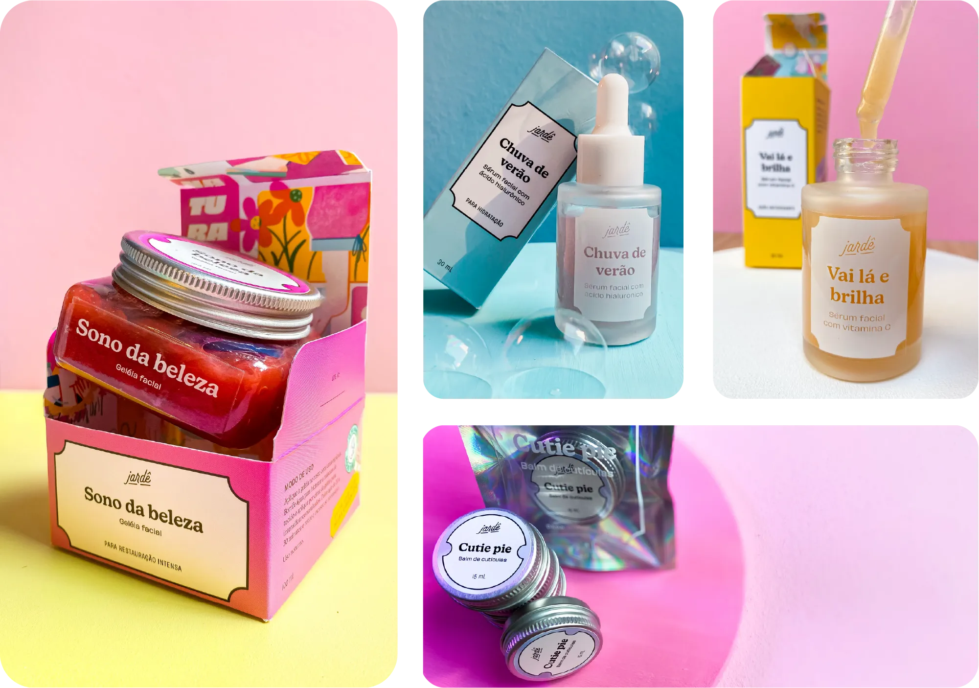
Just like the brand identity, the design for the packaging was kept as clean as possible but with the bright primary colours. The iconic shape of a vintage label on the front of the boxes really became one of the most recognisable elements in the identity.
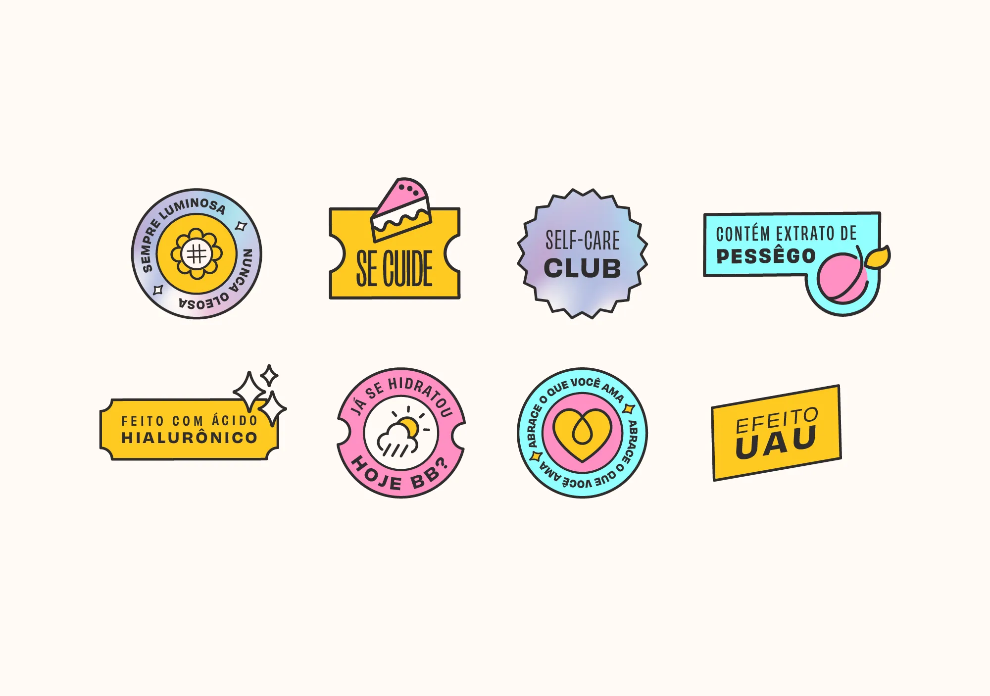
To double down on playfulness, vintage yet colourful stickers were designed to accessorise and give packaging a bit of an old skool feel. These stickers carry messages suitable for respective products and also for social media communication and promotion.
The latter was built as an inspirational webshop that shows off the brand’s skincare products and solutions. Both the vintage label shape as the stickers were used throughout for reinforcement and brand recognition.
Reflection and feedback
Looking back, this project really pushed me out of my comfort zone with the neobrutalist visual style and bright colour palette. The finished brand definitely looks different from the more minimalistic design style I normally gravitate to.
The client’s feedback almost couldn’t have been more postitive. One of their main points was how well their customers are receiving the design. Jardê’s products stand out from the crowd (by a lot) yet appeal greatly to the brand’s audience. Personally and from a visual design point of view, I was already very pleased with the resulting brand, but this feedback made getting out of my comfort zone even more rewarding.


